

You’ve built a survey, collected the data, and now it’s time to dive into analysis and reporting. But where do you even start?
Survey data can be overwhelming—those endless spreadsheets, and maybe you need to explain the results to someone who’s not a research expert. You can already imagine the questions, the comments, the back and forth. But not this time. This time, you’re going to make a great report—one that’s easy to understand, valuable, and complete.
In this article, we’ll show you how to create an engaging report that people will actually read. We’ve broken it down into steps, so you can jump in wherever you need.
Before you start, ask yourself: Who am I making this report for, and what’s the purpose?
A report for a busy executive won’t look like an academic presentation. Validating a concept is not the same as reporting on performance. So, keep this front and center:
“This report is for {{Reader}} to {{Objective}}.”
This simple line will help you trim or enrich your content as needed—saving you time and making your report sharper.
1. Clean Your Survey Data
If you collected the data yourself, chances are it needs some cleaning—and you won’t know what to fix until you actually look. Always make a copy of your original data before editing! Here’s what to check:
- Remove anyone who doesn’t fit your qualification criteria.
- Look for duplicates: Check IPs, emails, or identical answers.
- Delete unfinished responses: If someone bailed halfway, their data probably isn’t useful (unless partials are meaningful for your project).
- Watch for “straight-liners”: People who just pick the same answer every time.
- Check for odd completion times: Finishing way too fast or slow might mean junk data.
- Spot impossible or inconsistent answers: (e.g., “I never exercise, but I go to the gym twice a week.”)
- Review open-ended answers: Delete nonsense or “keyboard smash” responses.
- Validate formats: Make sure dates, emails, and other fields are consistent and make sense.
- Screen for outliers: Extreme claims (120 years old, 100 hours/week at work) are usually not real.
Fix obvious typos or honest mistakes if it makes your report clearer. Remember, many survey headaches come from confusing questions or too much complexity up front—pretesting your survey can save a lot of time later.
If you’re unsure, check out our simple principles of survey design.

2. Visualize Your Survey Data
Visualizing your data isn’t mandatory, but unless your reader is super technical, nobody wants to scroll through a giant Excel sheet. If they did, you probably wouldn’t be here.
Luckily, there are tons of easy ways to make your results look good—and much easier to understand. We even wrote a quick guide on visualizing survey data, with free tools if you want to see practical examples.
To save you time, here’s a quick rundown of popular tools you can use, depending on your audience and needs. Each one has its own strengths (and limitations)—and yes, you can combine them if needed:
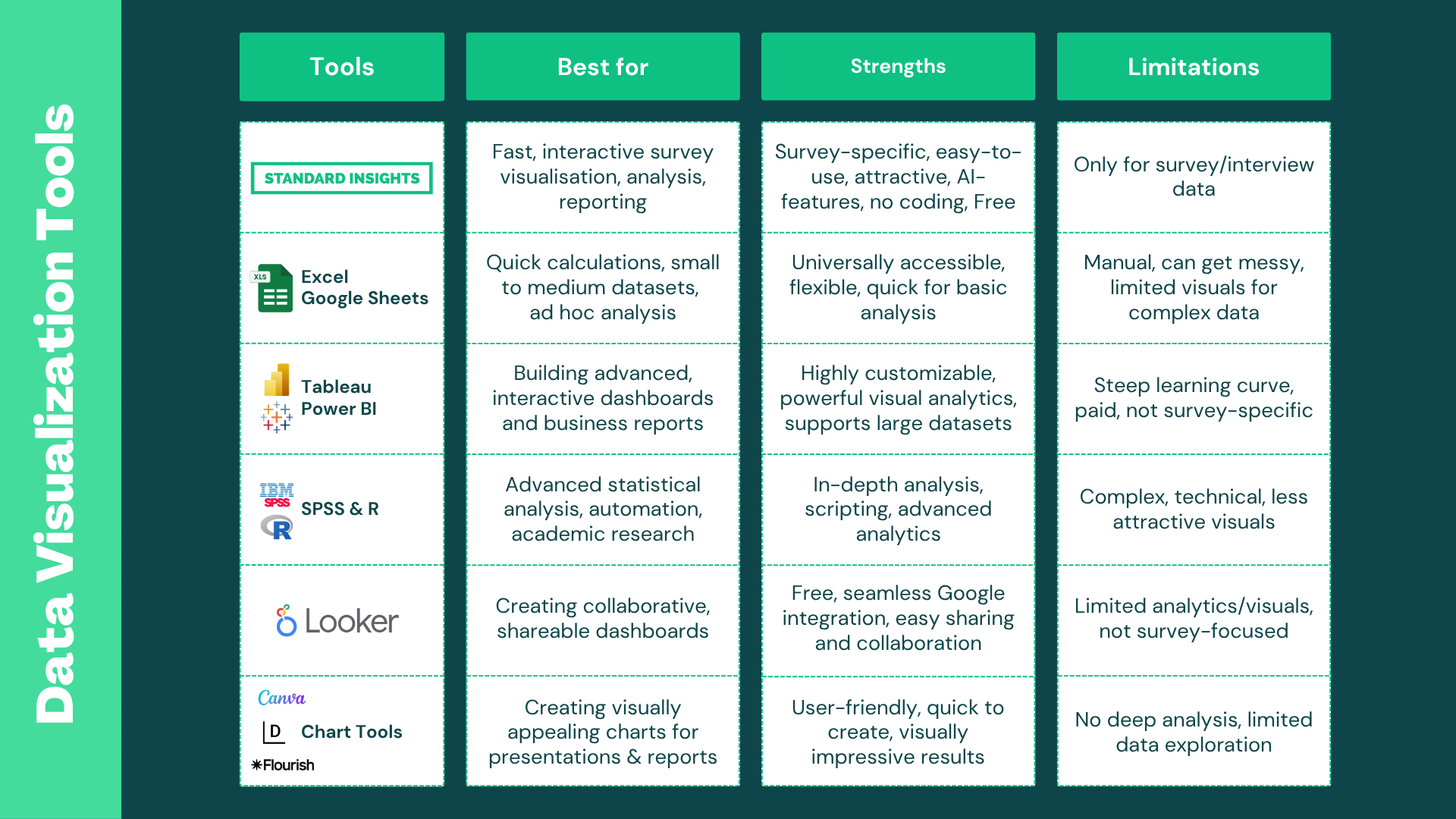
You can try to visualize your survey data for Free on the Standard Insights Platform; it’s compatible with over 15 survey builders.
3. Analyze Your Survey Data
Analyzing survey data can feel endless, but it doesn’t have to be. The best way to start? Just skim through all your questions and answers—write down anything that jumps out. Keep your research goals in mind, and don’t get lost chasing details that don’t matter.
Once you have a good feel for the results, here’s what to focus on:
- Open-ended questions: Group similar answers into themes or tags. Tools like Standard Insights can automate this with AI. Keep an eye out for strong, actionable feedback worth highlighting.
- Correlate with your existing data: Connect your survey results with what you already know—bring in interviews, past research, or CRM data for deeper context.
- Break down your audience: Compare results by gender, age, location, income, or create your own segments (like “Women, 25–35, living in Seattle, coffee drinkers”).
- Ask: “What does this actually mean?” Numbers are nice, but what’s the impact? If 60% like Product X, what can you do with that? Focus on takeaways that could drive action.
- Statistical testing (if needed): Use chi-square tests for differences between categorical groups, or t-tests/ANOVA for numeric data across groups.
Look for interesting nuggets, not just stuff your reader already knows. Spot gaps, trends, majorities, or surprises. Draw clear conclusions and suggest what to do next. To spark new insights, slice your data by different groups, compare segments, check outliers, and see how your findings stack up to other data sources.
At Standard Insights, we make this easy with AI-powered analysis and audience filtering—so you get more insight, less headache.

4. Build Your Survey Report
Your data is clean, you’ve visualized your survey, and uncovered lots of interesting findings. That’s a lot of work—now it’s time to share it, without making your reader go through the same slog.
Start like any good article: outline what your audience should learn, and in what order. Here’s a structure you can use:
What to Include in Your Survey Report
- Introduction
- Set the scene: What, why, when, and who the survey is for.
- Key takeaways: Give your audience a quick “TL;DR.”
- Methodology: How many respondents, survey length, type, etc.
- Results Presentation
- Organize your main findings by topic or research question. Follow a narrative—break your report into chapters and let your reasoning unfold as the reader goes. Include your best data visualizations. Combine related questions into bigger themes.
- Interpret results: explain patterns, compare them with previous data or goals. Highlight the insights you analyzed earlier—don’t just repeat what’s on your charts, but explain what it means.
- Recommendations & Next Steps
- Suggest what to focus on next. If you’re not the decision-maker, flag the important stuff so the right person can run with it.
- Full Results & Supporting Materials
- Make the full dataset and supporting materials available for those who want to dig deeper. Even if you don’t present everything, keep it accessible—like including the full question list, response tables, or raw data as appendices or downloads.
Customizing Your Report
Tailor your report to your audience: change up the colors, adapt charts, add your company’s branding, images, or even interview highlights. Make it yours!
Want to see an example? Here are examples of our consumer reports (PDF and interactive).

Ready to Create a Survey Report?
At Standard Insights, we’re all about making your survey journey easy—from building your survey to sharing the results. Create a free account, import your data, analyze your findings, and build customizable, shareable reports in just minutes.


