
Have you just collected survey data, but now find yourself dreading hours spent in spreadsheets, struggling to analyze and visualize your results? Maybe your survey platform’s built-in charts just aren’t flexible or powerful enough for your reporting needs.
No worries—we’ve got your back!
In just five minutes, you’ll learn how to turn your survey data into interactive charts and reports that are fully customizable, shareable, and best of all, free to get started.
We’ll show you the fastest method (with Standard Insights), plus a quick overview of the best data visualization alternatives like Excel, Tableau, and more, so you can pick what fits your workflow. Jump directly where you need:
- How to visualize your survey data with Standard Insights (fast & free)
- Best tools for survey data visualization (per use case)
- Visualization techniques: choosing the right chart for each question type
- Bonus: Survey chart generator [micro‑tool]
How to visualize your survey data
What Do You Need?
Before you begin, here’s what you need to visualize your survey data:
- Your survey data file (.XLS, .XLSX, or .CSV format)
Most survey tools support data export. If you haven’t started yet, use the Standard Insights survey builder, and check out our guide on 11 ways to find survey respondents. - Five minutes of your time
- A free Standard Insights account
(or another data visualization tool—see more options below)
This section focuses on creating interactive survey reports using Standard Insights. If you prefer alternative solutions, such as SPSS, Google Looker Studio, Power BI, or Tableau, please note that while these tools are powerful, they aren’t specifically designed for survey data and consumer research, unlike our platform.
You’ll find a comparison of data visualization solutions below.
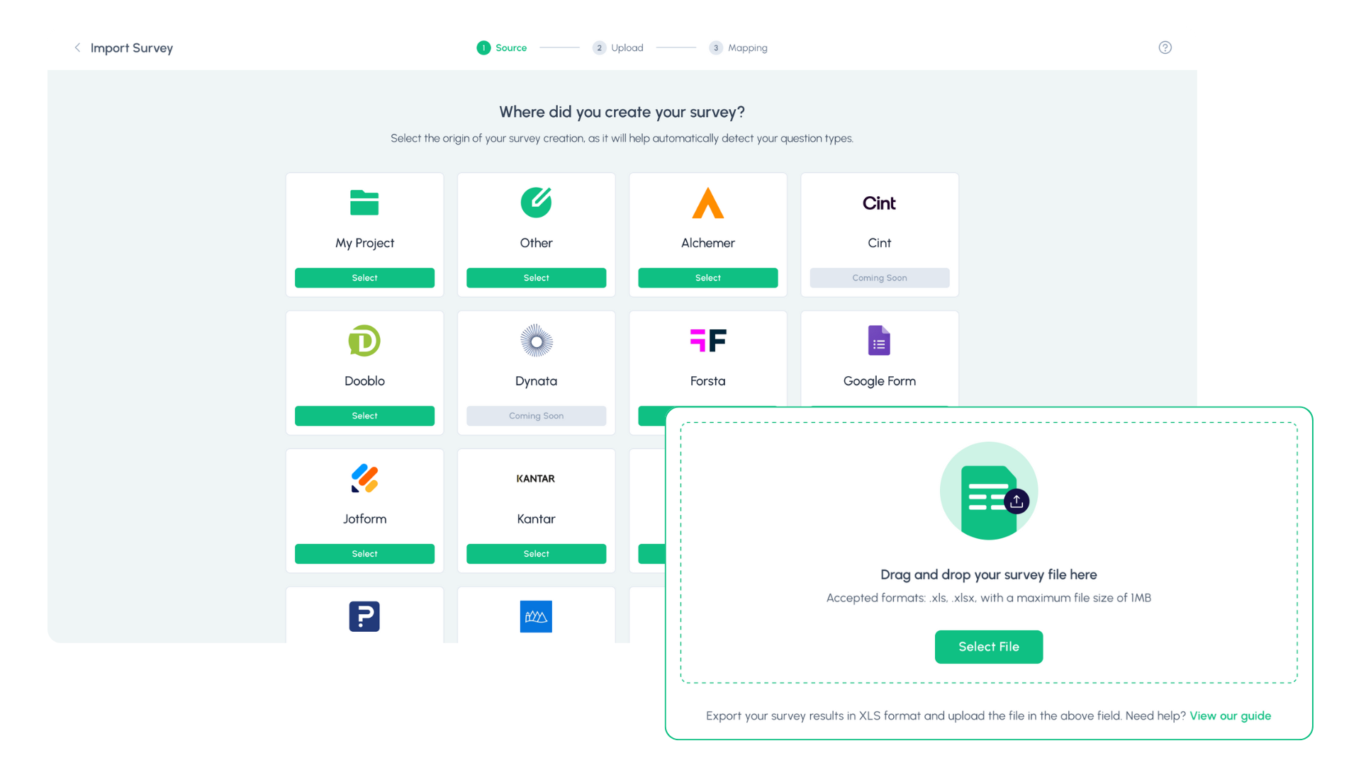
Step 1: Upload Your Data
Log in to your Standard Insights account. Select your survey source from our list of 15+ supported platforms. If your platform isn’t listed, choose “Standard Insights” and upload a .XLS, .XLSX, or .CSV file; just make sure it follows our formatting guide. You can also select “My platform isn’t listed” to request an integration, and our team will add it quickly.
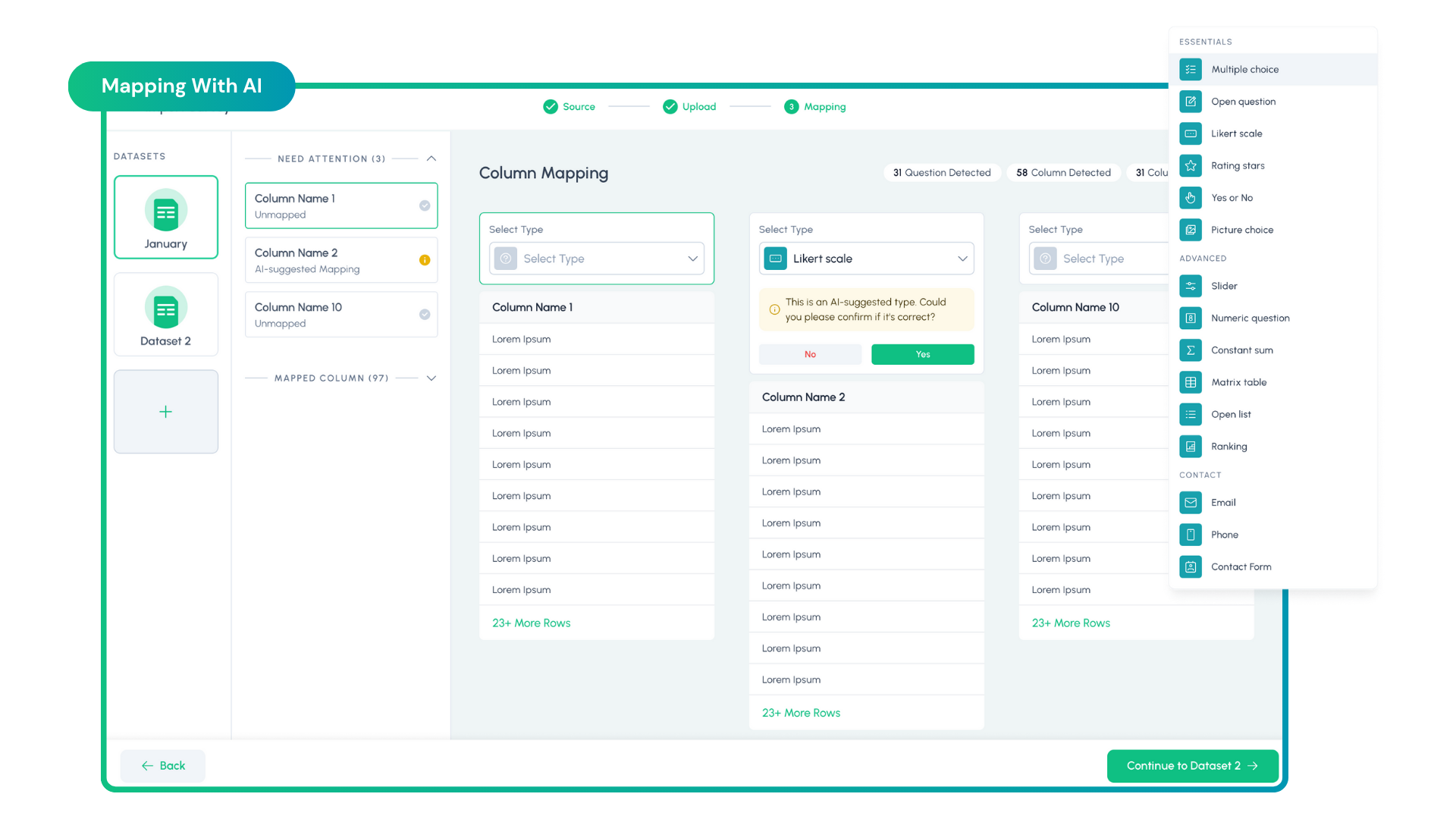
Step 2: Map Your Questions
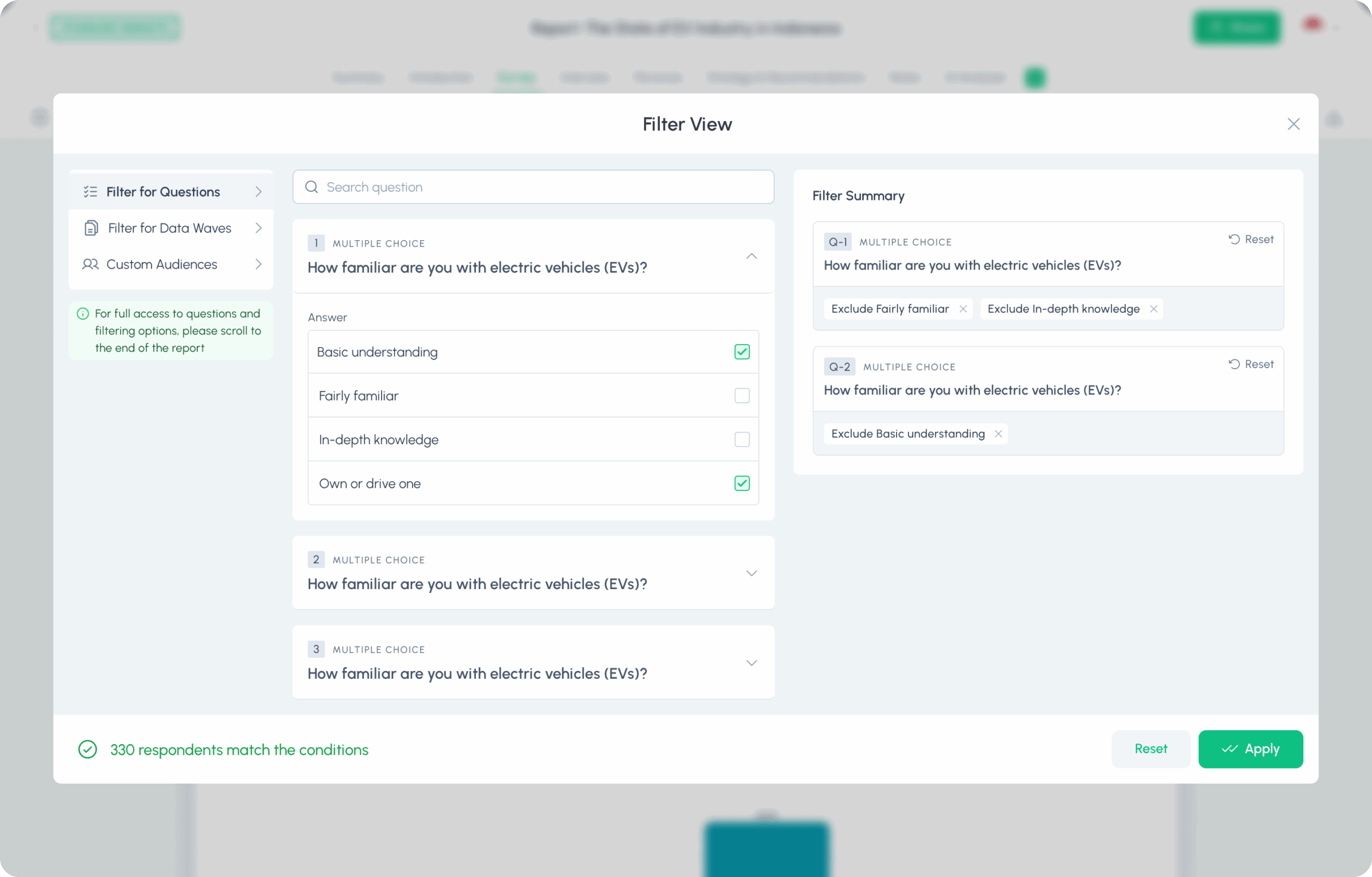
We automatically detect your survey questions and columns. For each one, confirm the correct type (Multiple Choice, Rating Scale, Open‑Ended, etc.). You can use our AI to auto‑recognize types, then quickly double‑check for accuracy. If something’s off, pick the right option from the dropdown.
Working with multiple waves or batches? You can add additional XLS/XLSX/CSV files to combine time periods or cohorts and compare them side by side.
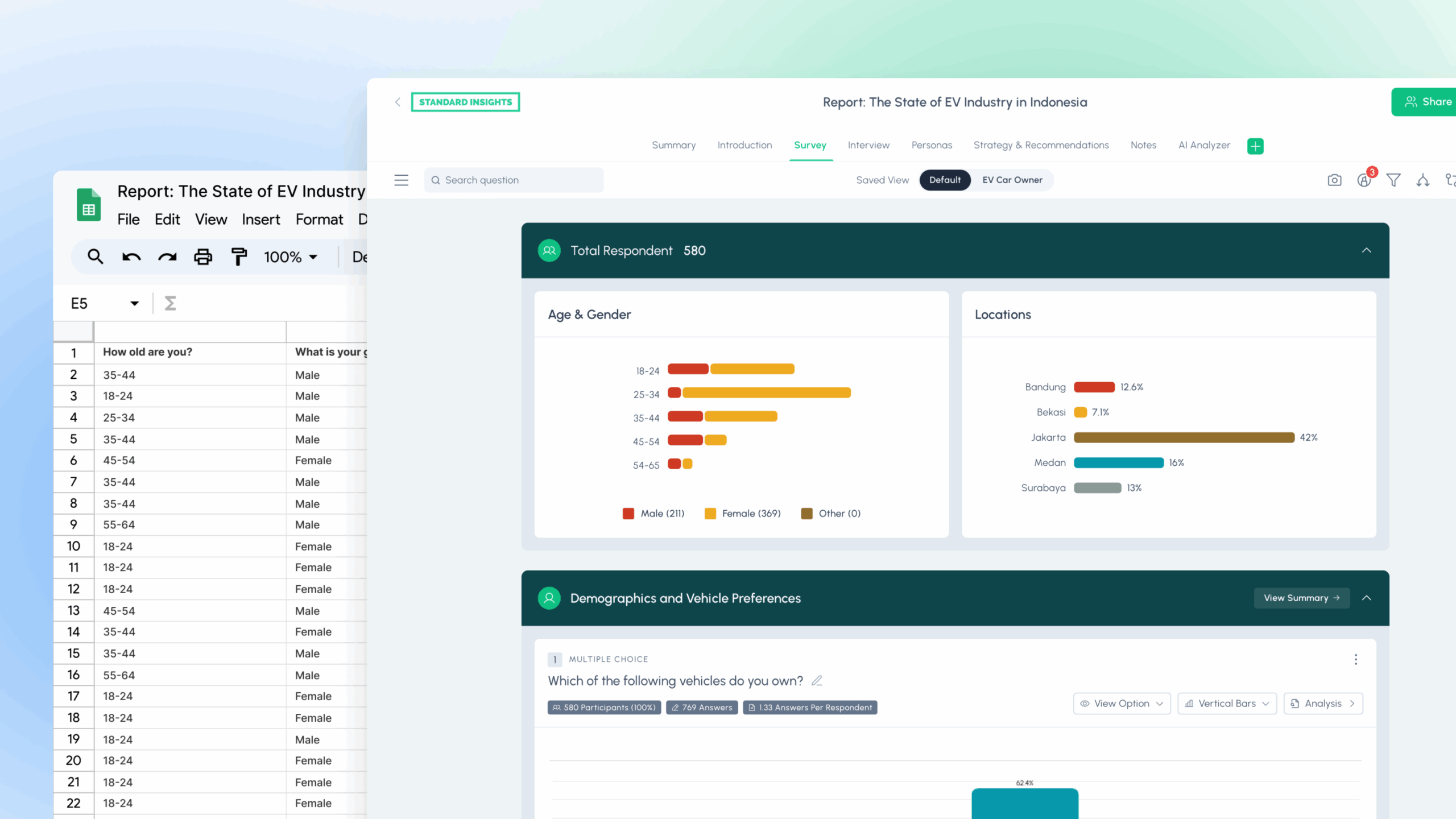
3. Your Report Is Ready—What’s Next?
Truth is, your interactive report is ready after just two steps. Now the real work (and fun) starts.
Use the steps below to analyze and share your results. If you want a deeper walkthrough, see our How to analyze & report survey data guide.
A. Customize Your Report
Make it feel like yours. Update colors, chart types, and titles to match your brand and the story you want to tell. Add a short intro, key takeaways, and simple navigation so busy readers can jump to what matters. If you have multiple audiences (execs vs. team), save separate views with different highlights.
B. Analyze Your Data
Go beyond the surface. Segment with filters (age, gender, market, wave), compare groups side by side, and create custom audiences. Pull themes from open‑ended answers with AI, then validate with the charts. Ask “so what?” for each finding, what action does this insight suggest? If needed, run quick tests (chi‑square for categorical differences, t‑tests/ANOVA for numeric) to confirm real gaps.
In Standard Insights, use our integrated tools to dig into your data, and use AI to analyze any question, a section of questions, or your entire report.
C. Enrich and Expand
A strong report explains more than the numbers. Readers usually want to know the purpose of the project, how it was conducted, when it took place, and what is included. Consider adding:
- Methodology and assumptions
- Context from qualitative interviews or notes
- Secondary sources or market context
- Selected quotes that clarify the “why” behind results
- Audience or segment summaries that make findings easier to recall
If you use Standard Insights, you can draft these sections manually or let AI generate them quickly. For example, you can auto‑create a market trends section to add secondary context. If you need additional tooling, see our list of 12 AI market research tools, each mapped to a specific use case.

D. Build Dashboards
Curate the essentials: your top metrics, trend lines, and a few diagnostic charts, into a single dashboard. Keep labels plain English, sort by importance, and add small notes. The dashboard is a practical addition to your report, as you can summarize and select specific findings without your reader having to go through all the details and survey questions, while being visually appealing.
E. Export and Share
Share securely with a link, or export for any workflow: PNG/PDF for slides, PPT for decks, CSV/SPSS for analysts. Add a short executive summary when you share: 3–5 bullets with the headline results and recommended next steps.
Which Data Visualization Tool is Best for You?
While Standard Insights is purpose-built for survey analysis, you might also consider these popular alternatives, especially if you already use them in your workflow or need advanced customization:
Summary Table: Data Visualization Tools
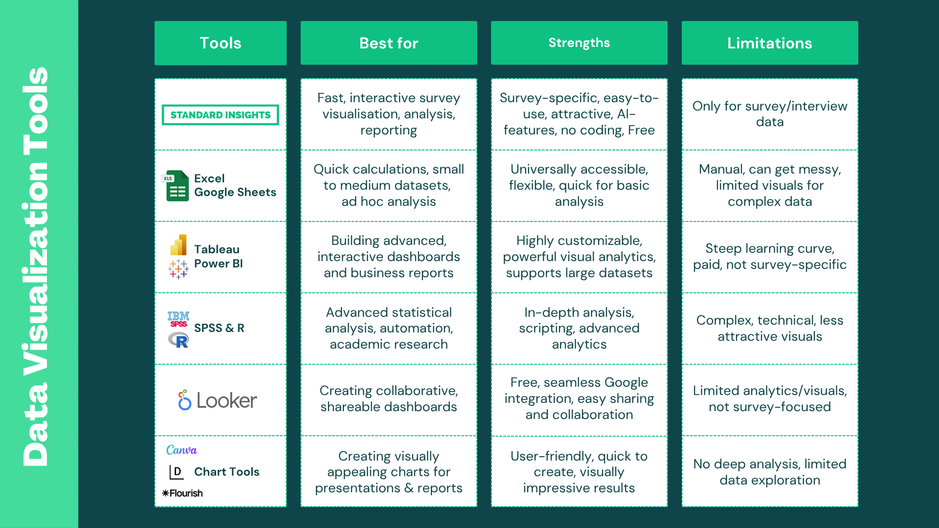
1. Microsoft Excel & Google Sheets
Most people have these tools, and they’re great for collecting, cleaning, and doing basic analysis. The downside: chart options are limited, visuals can look dated, and large or complex survey datasets get hard to manage fast. Still, they’re essential for prep work and a solid option for simple analysis.
Best for:
- Quick charts
- Basic summaries
- Small datasets
Strengths:
- Ubiquitous and familiar
- Quick for simple summaries
- No extra tools or setup needed
Limitations:
- Poor visual quality, charts can look “ugly” or messy
- Manual setup for survey analysis
- Gets unwieldy for large or complex surveys
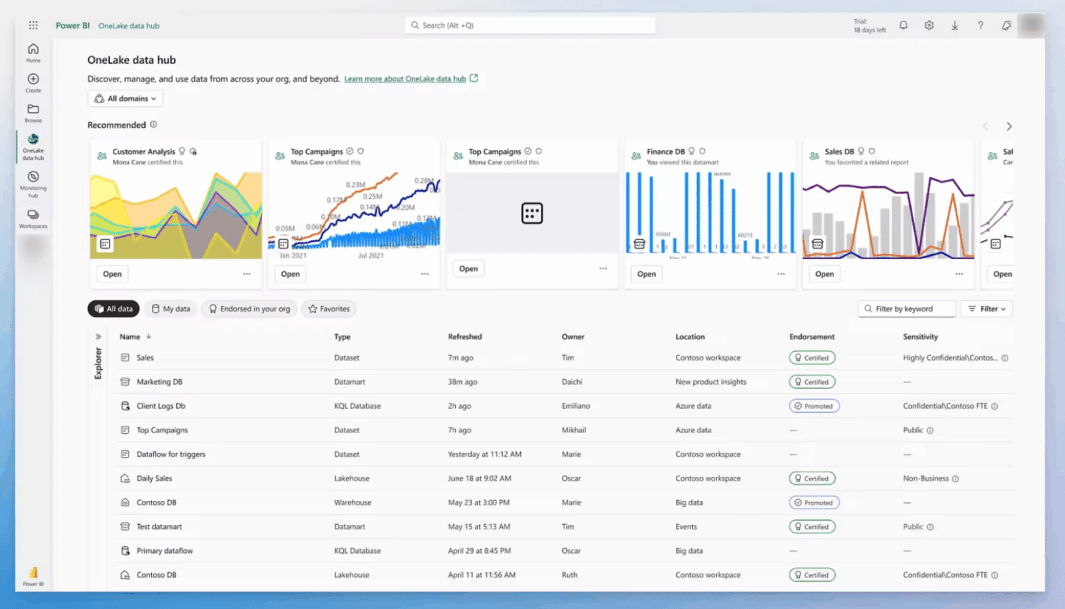
2/ Tableau & Power BI
These are powerful, professional-grade tools for building dashboards, especially when combining survey data with other business metrics like sales or web traffic. However, both have a steep learning curve and are not designed specifically for surveys.
Best for:
- Combining multiple data sources
- Advanced dashboards and business presentations
Strengths:
- Highly customizable, powerful analytics
- Interactive dashboards
- Great for storytelling with mixed data (e.g., surveys + sales)
Limitations:
- Complicated to set up and learn
- May require significant time investment
- Paid licenses are needed for sharing and advanced features
- Not tailored for survey data—may be overkill for simple projects
3. SPSS & R
For advanced statistics and academic research, SPSS and R are hard to beat. The trade‑off: they require specialized skills, and their default charts are more functional than polished. They’re often required for rigorous academic work.
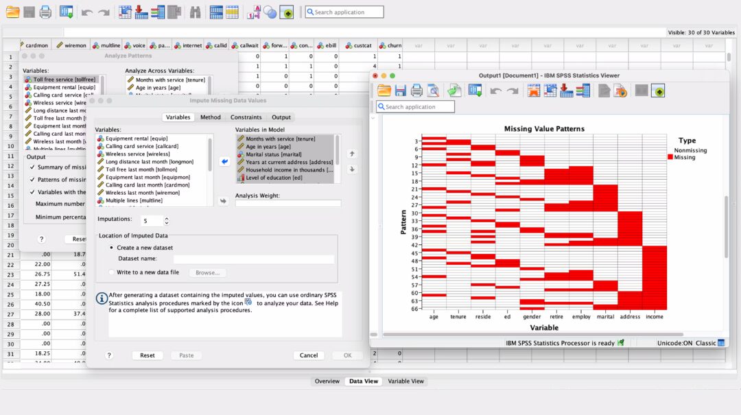
Best for:
- Academic research
- Advanced statistics
- Custom analyses
Strengths:
- Deep, powerful statistical analysis
- Essential for researchers and academics
- Scriptable for automation
Limitations:
- Complex and technical—requires coding/statistics knowledge
- Visuals are basic and unattractive
- Overkill for most brands or marketing teams
4. Google Looker Studio
Looker Studio is a web-based dashboard tool with easy sharing and collaboration. For some, it is more user-friendly than Tableau or Power BI, but it isn’t tailored for survey specifics.
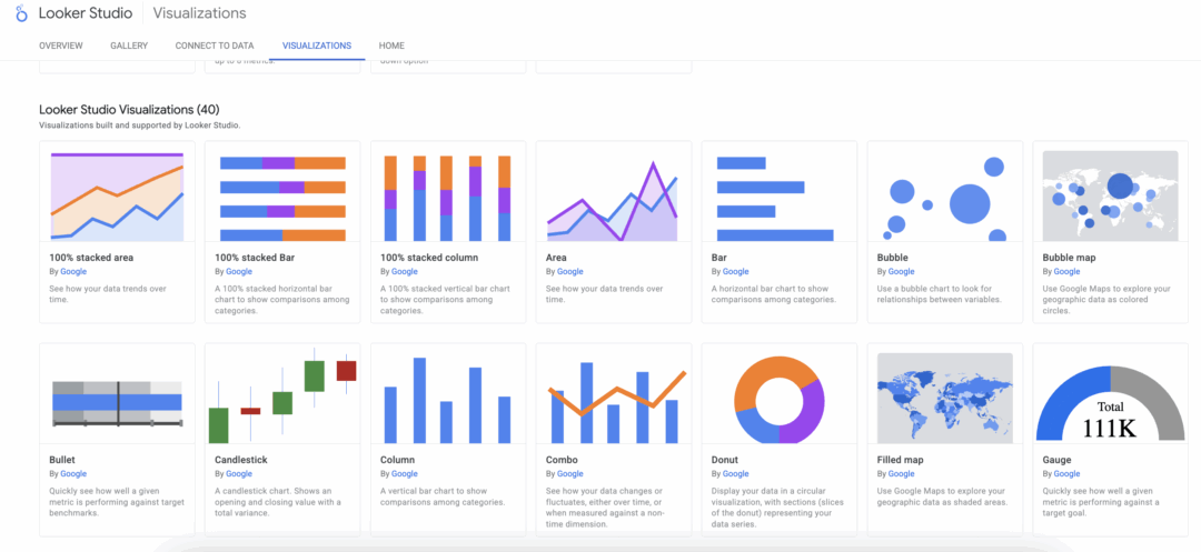
Best for:
- Collaborative cloud dashboards
- Simple reporting
- Google ecosystem
Strengths:
- Free and integrates with Google products
- Good for simple dashboards
- Easy sharing and publishing
Limitations:
- Limited survey analytics and customization
- Not as flexible as more advanced tools
- Not specifically built for survey data
5. Online Chart Tools (Datawrapper, Flourish, etc.)
Great for creating polished, presentation‑ready visuals. Perfect for articles and decks. The limitation: they don’t offer deep survey analysis or granular breakdowns. Before we built our platform, these tools were part of our day‑to‑day stack to produce pretty charts for clients.
Best for:
- Quick, attractive visuals for articles, presentations, or reports
Strengths:
- Attractive, modern visuals
- Easy to use for content creation
- Fast setup, some free options
Limitations:
- Not suitable for detailed survey analysis
- Limited data exploration or the ability to drill down
- Best as a supplement for presentations, not for full survey reporting
6. Standard Insights
Standard Insights is purpose-built for survey data, making it fast and easy to analyze, visualize, and share survey results, even if you have no technical background. AI-powered features help you uncover key findings and trends automatically, so you spend less time digging through data and more time acting on insights.

Best for:
- Fast, intuitive survey research and reporting
- End-to-end workflow: from survey creation to insights
- Anyone who wants to avoid manual data wrangling
Strengths:
- Complete suite: build surveys, find respondents, analyze, and report—all in one tool
- Survey-specific templates and visualizations
- AI-powered insights and automated key findings
- No coding or technical setup required
- Beautiful, ready-to-share visuals
Limitations:
- Designed for survey/interview data only, not for general business analytics
- Advanced features (AI, high-volume usage) require a paid license
Learn more about visualizing your survey data with Standard Insights, or create your free account.
Visualization techniques: Choose the right chart for your survey questions
The right chart depends on what you want readers to see first. Use the guide below to decide quickly and avoid common mistakes.
Bar chart (horizontal or vertical)

Bar charts cover about 80% of needs. They’re clear, easy to compare, and work for any audience. Use horizontal bars when labels are long; sort bars from highest to lowest. If you have many small categories, group them into “Other.”
- Best for: single‑choice questions; multiple‑choice (show “% of respondents who selected X”); demographics with many categories.
Pie/Donut chart

Good for showing parts of a whole at a glance. Keep it to a few slices so it stays readable, and label slices with exact percentages.
- Best for: single‑choice with 2–5 options; simple demographics (2–3 groups).
Stacked bar

Shows how responses split within each item. Great when you want the full distribution in one bar. Keep the color order consistent and limit segments to 4–5 for readability.
- Best for: Likert/rating questions; matrix items; select‑all shares.
Diverging stacked bar
Centers the neutral option to highlight the balance of negative vs neutral vs positive. This makes agreement vs disagreement obvious at a glance.
- Best for: 5‑ or 7‑point Likert scales with a midpoint.
Heatmap

Let patterns stand out when there are many items or segments. Use a simple color scale, add a legend, and sort rows/columns to reveal trends.
- Best for: matrix/grid questions; comparing attributes across teams, products, or markets.
Grouped/side‑by‑side bars
Straightforward segment comparisons on the same question. Keep the category order and colors consistent across groups, and show the base size (n=) in a note.
- Best for: demographic breakdowns (e.g., men vs women); comparing waves when bars are clearer than lines.
NPS distribution + score
Show Detractors, Passives, and Promoters alongside the NPS number. This gives context the single score can’t. Want to dig deeper? Try our free NPS calculator.
- Best for: Net Promoter Score (0–10).
Line chart
Clean view of change over time. Label the last point, keep a consistent y‑axis, and use small multiples if you’re comparing several segments.
- Best for: tracking the same metric across survey waves; segment trends over time.
Other advanced chart types

There are many other charts you can use (radar/spider, bump charts, histograms, dot plots, area charts). These can be helpful for specific needs, but add complexity. In Standard Insights, you can build boards with 30+ chart types and report sections. If you’re doing academic or heavy statistical work, you may prefer a traditional BI tool.
If you are looking for more data chart visualization, and uses, check out this great catalogue.
The bottom line? Don’t overthink it. Start with a bar chart. If you need parts of a whole, use a pie/donut with few slices. For ratings, use stacked or diverging stacked bars. For trends, use a line chart.
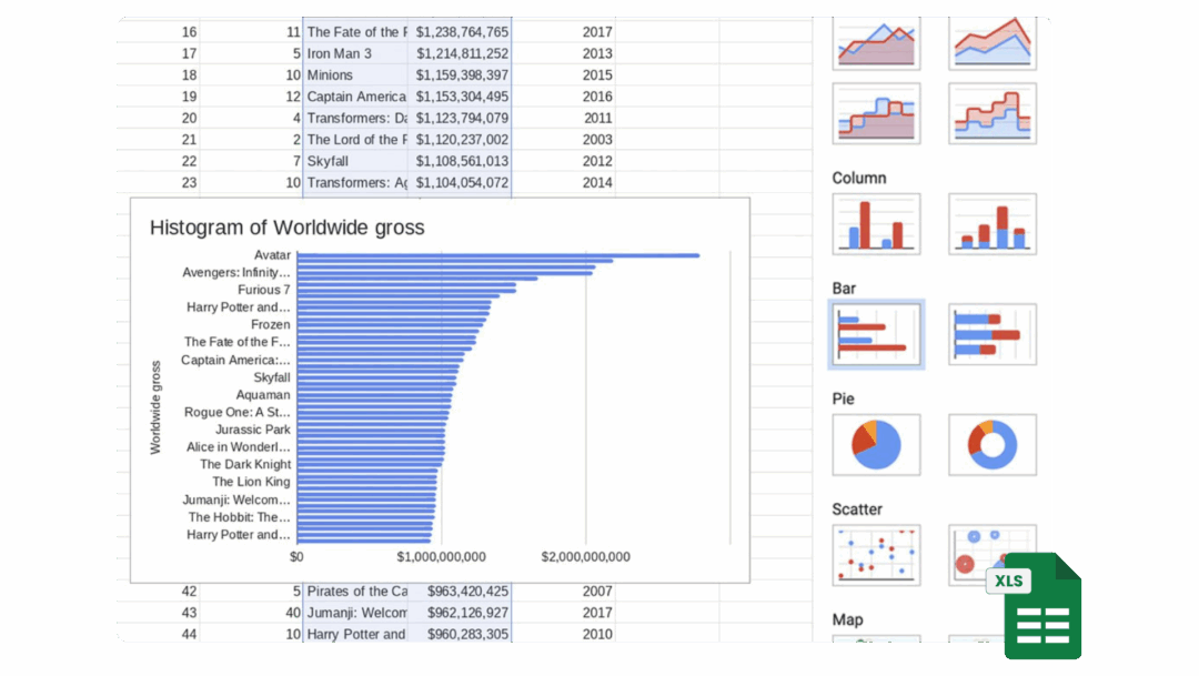
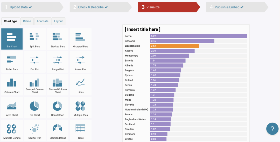
Survey chart generator
Just looking to create a chart or two for a report and make sense of your data? Use the survey chart generator below. Paste your answers (one per line), add your question/title, choose a chart type, and generate your chart.
This online tool is best for simple questions and small datasets. It may have limitations with complex question types or very large samples. If you need a more complete solution, create a free Standard Insights account and upload your .XLS, .XLSX, or .CSV file. From there, your survey data will be visualized instantly, and you’ll be able to filter, split, and segment your results, with access to more advanced chart styles.
Quick Chart Generator
Enjoyed this? Create a full, interactive report with filters, segments, and AI-powered insights.
Wrapping Up
Visualizing your survey data doesn’t have to be complicated or time-consuming. With Standard Insights, you go from raw XLS data to an interactive, customizable report in minutes, no technical skills required.
Frequently Asked Questions
How do I turn raw survey data into a shareable report in minutes?
Upload your .XLS, .XLSX, or .CSV file to Standard Insights, map question types (Multiple Choice, Likert, Open‑Ended, etc.), and your interactive report is generated automatically. From there, customize colors and chart types, add key takeaways, and share via secure link or export (PNG, PPT, PDF, CSV, SPSS).
What’s the best way to analyze survey data without advanced stats skills?
Start with segmentation and filtering (age, gender, market, wave) and compare groups side by side. Use AI to summarize open‑ended responses into themes and to surface key findings. Only run statistical tests (chi‑square, t‑tests/ANOVA) when you need to confirm real differences. Focus every finding on “So what?”, the action it enables.
Which charts should I use for each survey question type?
Bar charts cover most needs. Use stacked or diverging stacked bars for Likert scales, pies/donuts for small “parts‑of‑whole,” lines for trends over time, and grouped bars for segment comparisons. For dense matrices, use heatmaps. If in doubt, start with a bar chart and refine.
How is Standard Insights different from Excel, Tableau, or Looker Studio?
Standard Insights is purpose‑built for surveys: automated question mapping, survey‑specific visualizations, AI insights, and quick report building, no coding. Excel/Sheets are great for basics; Tableau/Power BI excel at complex mixed‑data dashboards but have steep learning curves; Looker Studio is easy to share but not survey‑specific; SPSS/R are for advanced statistics.
Can I combine multiple survey waves or cohorts in one report?
Yes. Upload additional files (XLS/XLSX/CSV) to merge waves or cohorts, then compare over time or by segment using saved filters and dashboards. You can build personas from segments and add qualitative pages to explain the “why” behind trends.
How do I share results securely with different stakeholders?
Use consistent terminology: survey data visualization, AI‑powered survey analysis, interactive survey reports, and segmentation filters—these match how users search and how AI summarizes your content.


