Have you just collected survey data, but now find yourself dreading hours spent in spreadsheets, struggling to analyze and visualize your results? Maybe your survey platform’s built-in charts just aren’t flexible or powerful enough for your reporting needs.
No worries—we’ve got your back!
In just five minutes, you’ll learn how to turn your survey data into interactive charts and reports that are fully customizable, shareable, and—best of all—free to get started.
We’ll show you the fastest method (with Standard Insights), plus a quick overview of the best data visualization alternatives like Excel, Tableau, and more, so you can pick what fits your workflow.
What Do You Need?
Before you begin, here’s what you need to visualize your survey data:
- Your survey data file
(.XLS, .XLSX, or .CSV format) - Five minutes of your time
- A free Standard Insights account
(or another data visualization tool—see more options below)
This guide focuses on creating interactive survey reports using Standard Insights.
If you prefer other solutions—such as SPSS, Google Looker Studio, Power BI, or Tableau—note that while these are powerful, they aren’t specifically designed for survey data and consumer research like our platform.
You’ll find a comparison of data visualization solutions below.
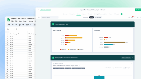
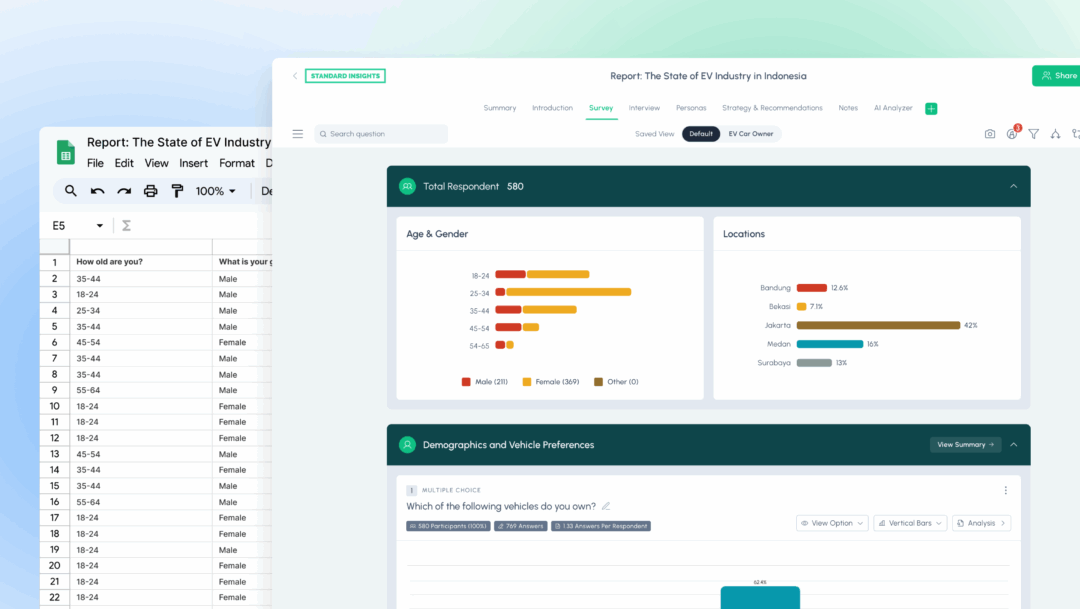
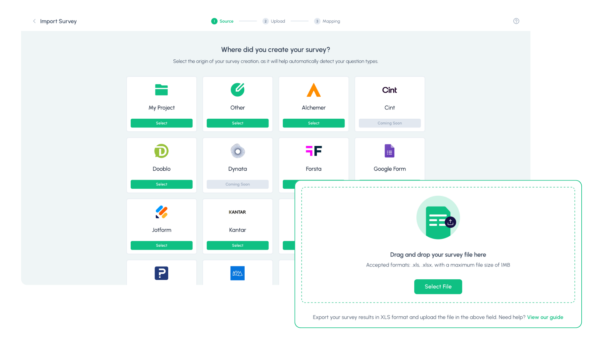
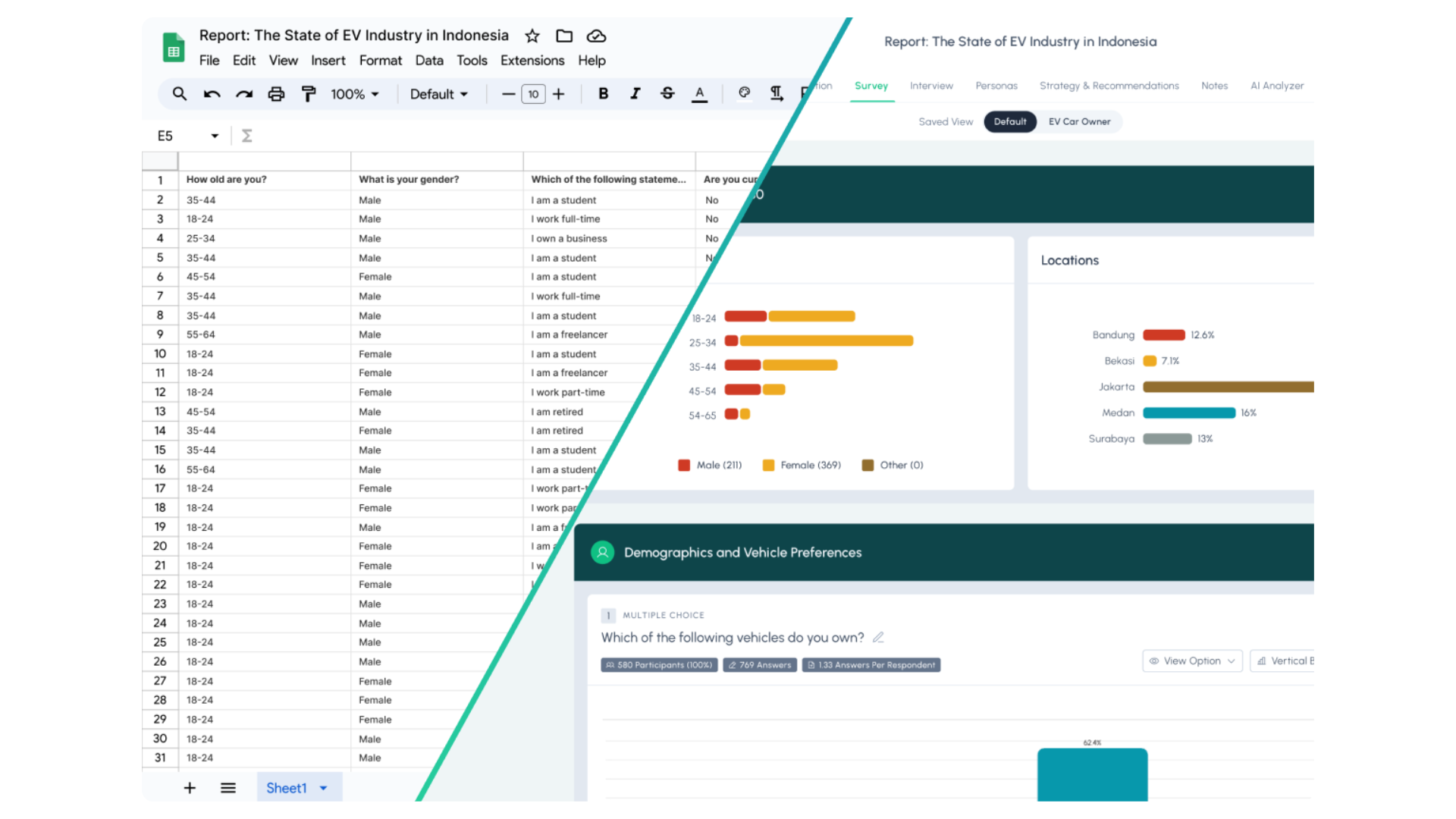
Step 1: Upload Your Data
Log in to your Standard Insights account. Select your survey source from our list of 15+ supported platforms. If your platform isn’t listed, simply choose “My Project” and upload your .XLS, .XLSX, or .CSV file—just make sure your columns have clear headers.
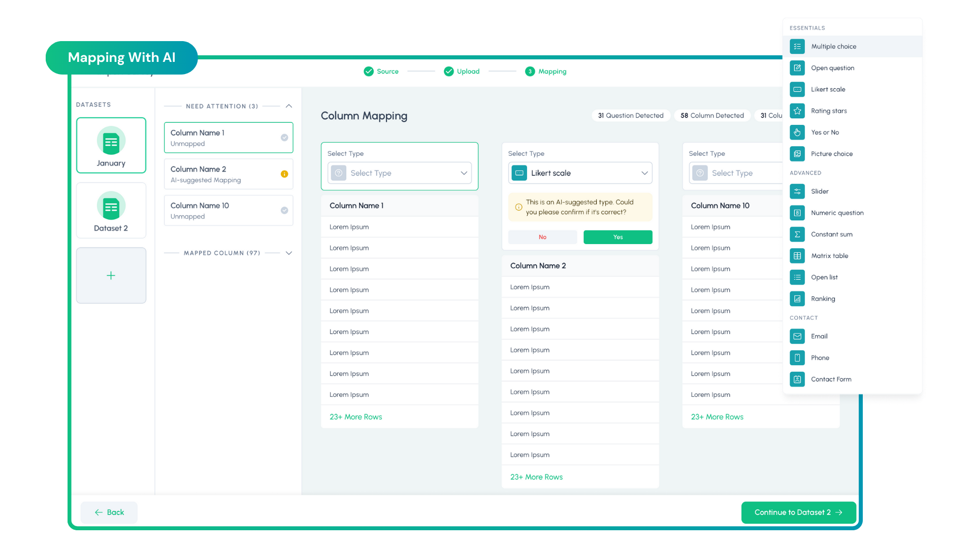
Step 2: Map Your Questions
Our platform automatically detects all your survey questions and columns. For each question, choose the correct type—such as Multiple Choice, Rating Scale, or Open-Ended. You can use our AI to auto-recognize question types, and quickly double-check for accuracy. If a question type is incorrect, simply select the right option from the dropdown.
3. Your Report Is Ready—What’s Next?
We haven’t been 100% honest—your interactive report is ready after just two steps! But now the real fun begins.
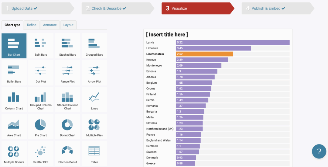
A. Customize Your Report
Personalize your charts’ colors and types to match your brand. Add banners or navigation for a professional look.
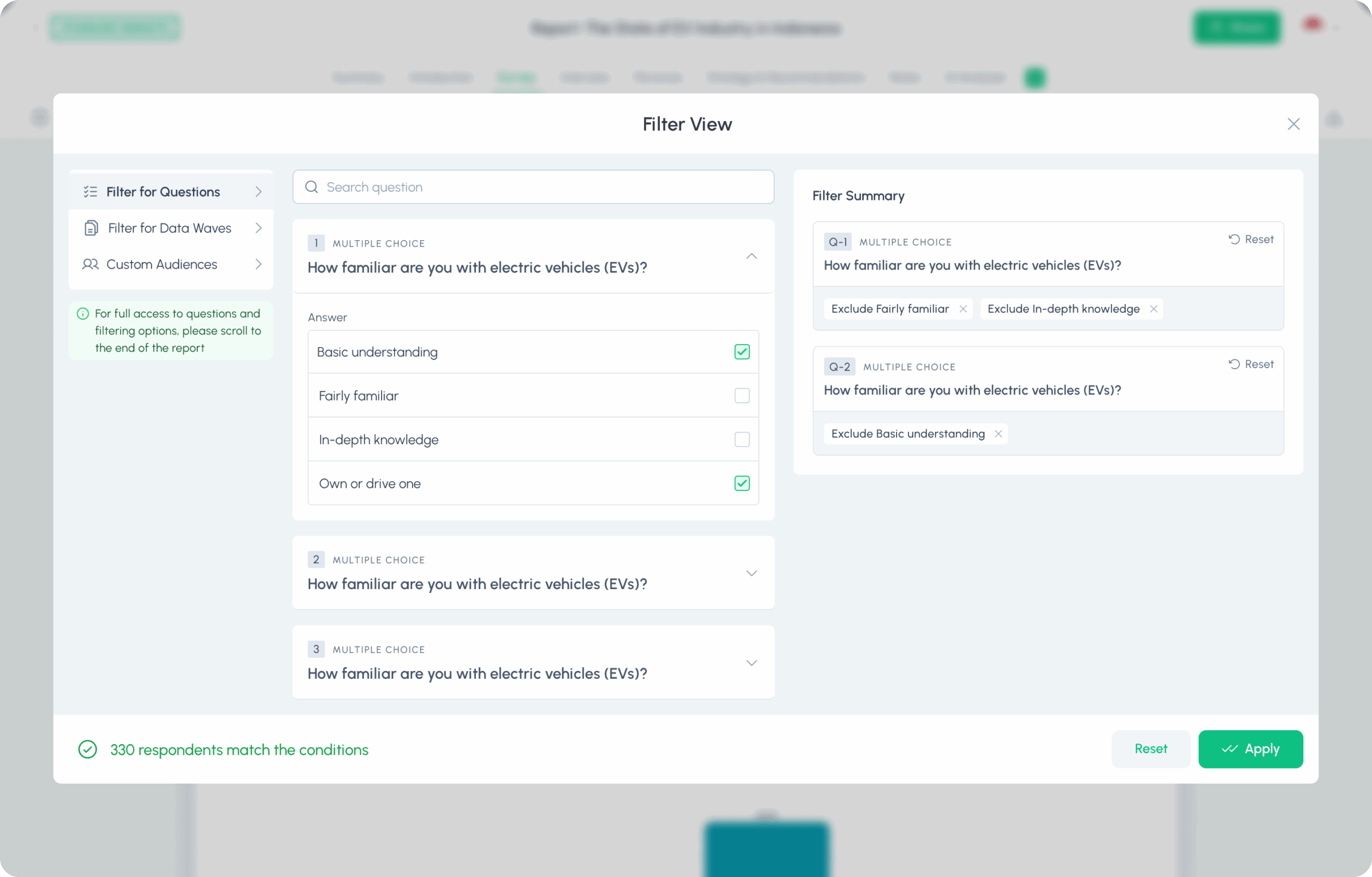
B. Analyze Your Data
Segment your data with filters, compare groups, and let our AI generate insights—or chat with the AI for deeper answers.
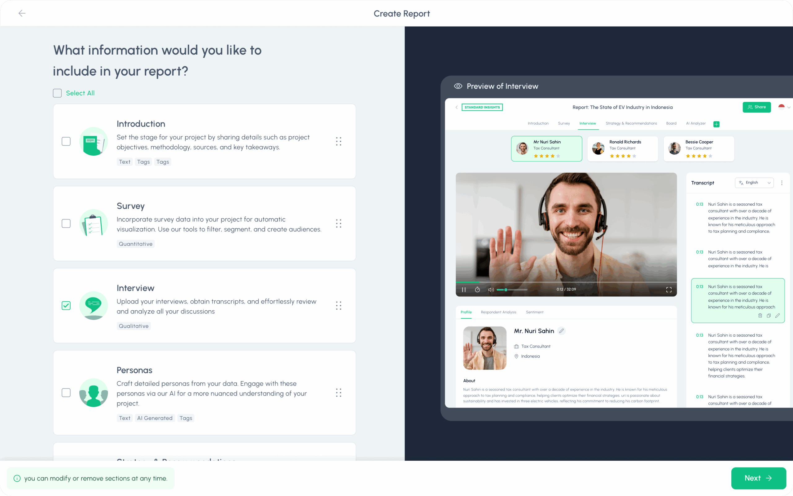
C. Enrich and Expand
Add new pages for introductions or qualitative interviews. Use our Persona tool to create respondent profiles.
D. Build Dashboards
Curate key charts and metrics into a dashboard for fast, effective storytelling.
E. Export and Share
Securely share reports via links or export them in multiple formats (PNG, PPT, PDF, CSV, SPSS).
Which Data Visualization Tool is Best for You?
While Standard Insights is purpose-built for survey analysis, you might also consider these popular alternatives—especially if you already use them in your workflow or need advanced customization:
Summary Table: Data Visualization Tools
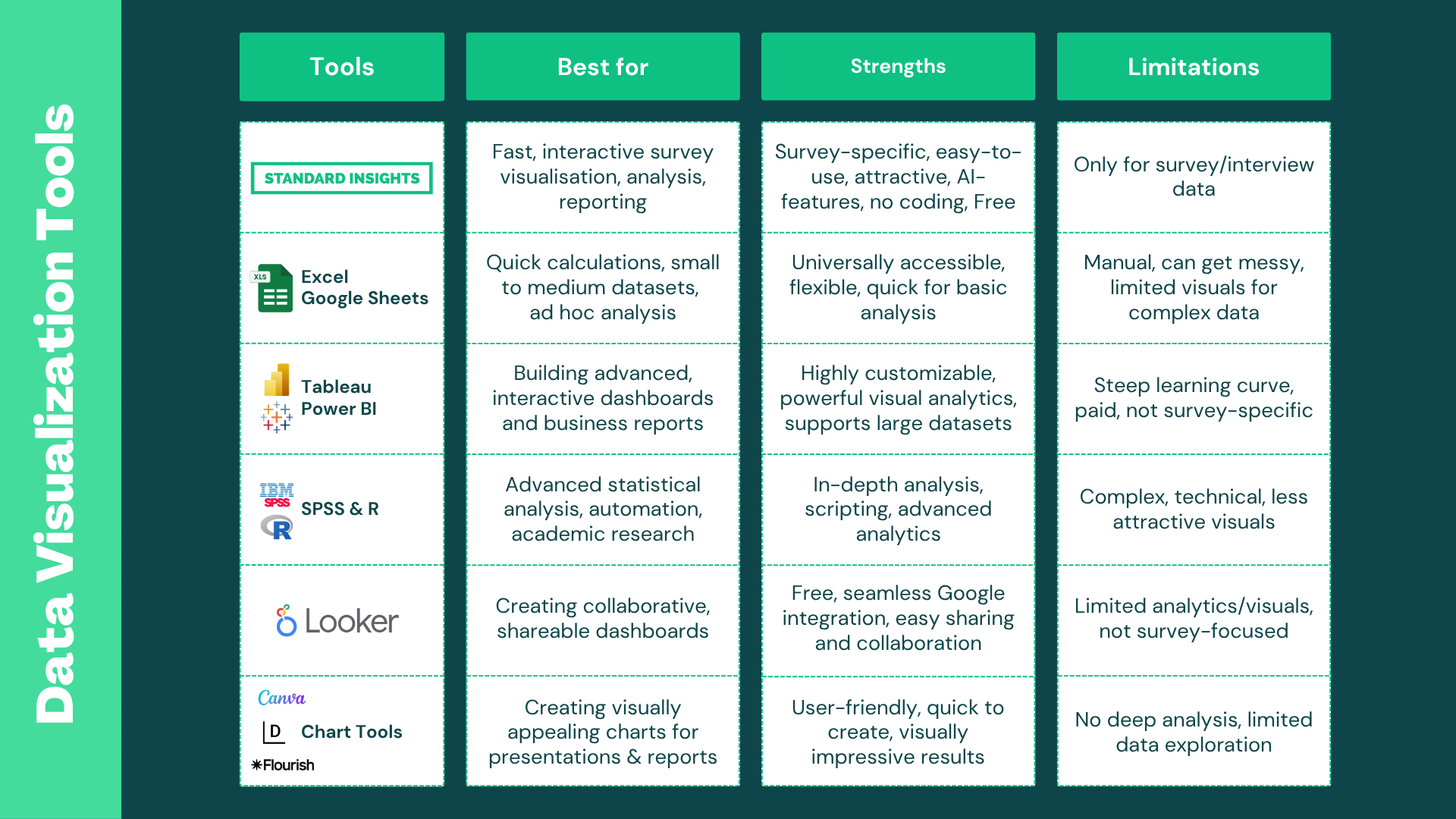
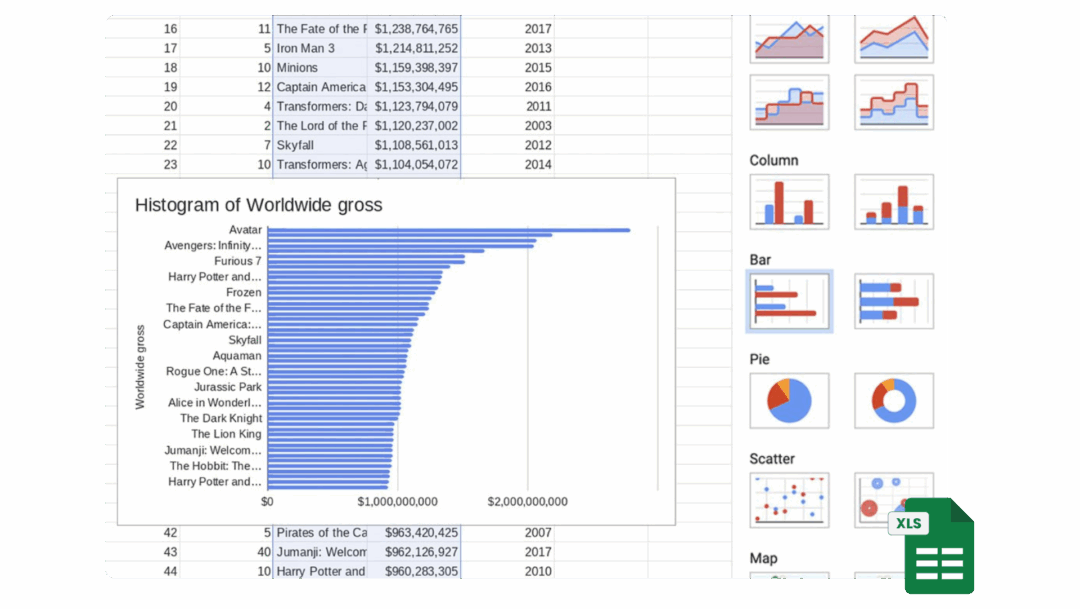
1. Microsoft Excel & Google Sheets
Everyone has access to these spreadsheet tools, but their data visualization features are limited. Charts often look outdated, and large or complex survey datasets can quickly become unmanageable.
Best for:
- Quick charts
- Basic summaries
- Small datasets
Strengths:
- Ubiquitous and familiar
- Quick for simple summaries
- No extra tools or setup needed
Limitations:
- Poor visual quality—charts can look “ugly” or messy
- Manual setup for survey analysis
- Gets unwieldy for large or complex surveys
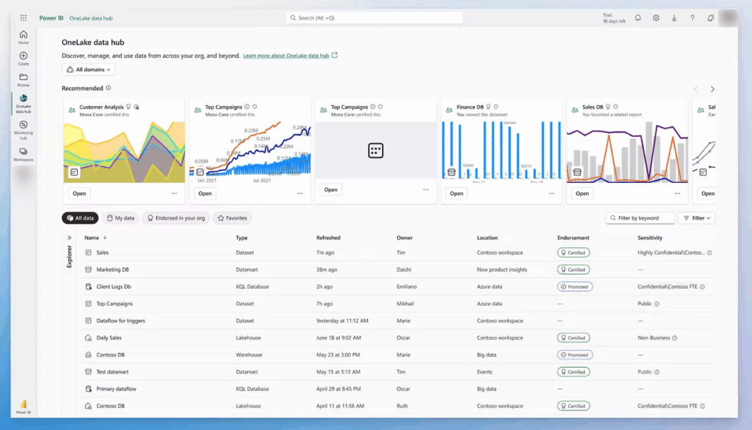
2/ Tableau & Power BI
These are powerful, professional-grade tools for building dashboards—especially when combining survey data with other business metrics like sales or web traffic. However, both have a steep learning curve and are not designed specifically for surveys.
Best for:
- Combining multiple data sources
- Advanced dashboards and business presentations
Strengths:
- Highly customizable, powerful analytics
- Interactive dashboards
- Great for storytelling with mixed data (e.g., surveys + sales)
Limitations:
- Complicated to set up and learn
- May require significant time investment
- Paid licenses needed for sharing and advanced features
- Not tailored for survey data—may be overkill for simple projects
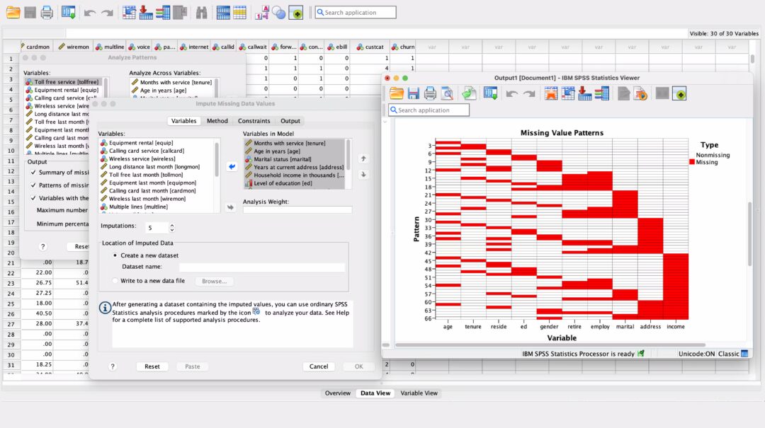
3. SPSS & R
If you need advanced statistics for academic research, SPSS and R are unmatched. However, they require specialized skills and tend to produce charts that are functional rather than beautiful.
Best for:
- Academic research
- Advanced statistics
- Custom analyses
Strengths:
- Deep, powerful statistical analysis
- Essential for researchers and academics
- Scriptable for automation
Limitations:
- Complex and technical—requires coding/statistics knowledge
- Visuals are basic and unattractive
- Overkill for most brands or marketing teams
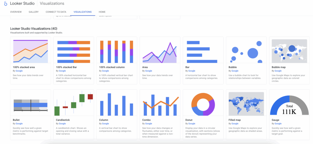
4. Google Looker Studio
Looker Studio is a web-based dashboard tool with easy sharing and collaboration. It’s more user-friendly than Tableau or Power BI, but still isn’t tailored for survey specifics.
Best for:
- Collaborative cloud dashboards
- Simple reporting
- Google ecosystem
Strengths:
- Free and integrates with Google products
- Good for simple dashboards
- Easy sharing and publishing
Limitations:
- Limited survey analytics and customization
- Not as flexible as more advanced tools
- Not specifically built for survey data
5. Online Chart Tools (Datawrapper, Flourish, etc.)
These tools are perfect for making visually striking charts and graphics for articles or presentations. However, they don’t provide in-depth analysis or granular breakdowns of survey data.
Best for:
- Quick, attractive visuals for articles, presentations, or reports
Strengths:
- Attractive, modern visuals
- Easy to use for content creation
- Fast setup, some free options
Limitations:
- Not suitable for detailed survey analysis
- Limited data exploration or ability to drill down
- Best as a supplement for presentations, not for full survey reporting
6. Standard Insights
Standard Insights is purpose-built for survey data—making it fast and easy to analyze, visualize, and share survey results, even if you have no technical background. AI-powered features help you uncover key findings and trends automatically, so you spend less time digging through data and more time acting on insights.
Best for:
- Fast, intuitive survey research and reporting
- End-to-end workflow: from survey creation to insights
- Anyone who wants to avoid manual data wrangling
Strengths:
- Complete suite: build surveys, find respondents, analyze, and report—all in one tool
- Survey-specific templates and visualizations
- AI-powered insights and automated key findings
- No coding or technical setup required
- Beautiful, ready-to-share visuals
Limitations:
- Designed for survey/interview data only—not for general business analytics
- Advanced features (AI, high-volume usage) require a paid license
Wrapping Up
Visualizing your survey data doesn’t have to be complicated or time-consuming. With Standard Insights, you go from raw XLS data to an interactive, customizable report in minutes—no technical skills required.